Maximizing website conversion rates remains one of the single biggest challenges for marketers today. Effective SEO and PPC can significantly increase website traffic. But raking high on search engines and driving website traffic is just the first step. Your site needs to keep visitors’ attention, convey the value of your offer and compel them to take a desired action — complete a form, download a document, or call your business.
If your website conversion rates are lacking, your landing page design may an overhaul. The question you have to ask yourself is: how many leads or sales are you losing due to sub-par landing page design?
The good news is website conversion rates are something you can directly impact and improve. Even small landing page design changes can dramatically impact visitor engagement and conversion rates. Here’s an example:
Researchers tracked the impact of a baby’s gaze in a diaper ad. In this first version, users’ eyes were drawn to the baby’s face, attention on the ad copy was reduced.
In the second version, a simple change produced big positive results.
By choosing a photo of a baby “looking” at the ad’s headline, users’ eyes were drawn to the text. Our eyes are naturally drawn to look where others are looking. Even if it’s a picture of baby in an ad.
What subtle improvements could you make to your company’s landing pages to increase conversion rates? Here are our top five examples:
1. Choose an image that supports the call-to-action.
It’s easy to simply slap a header image from a stock photo site on your landing page and call it a day. But it can really pay off to use an image that works in tandem with your headline and call to action. The right image isn’t just eye candy. It’s there to convey an important message to the user, and to provide important context.
Here’s an exercise to try: look at your header image without the headline, or the text to explain it. Does it still “say” anything about your product or service? If not, consider looking for something that compliments the text. Netflix does a great job of this on their signup page:
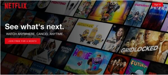
The headline “See What’s Next” is simple, but effective. There’s an implicit question there: “What is next?” “What could I be watching?” The question is then reinforced and partially answered by the visual of media titles in a grid, stretching out beyond the borders of the screen.
Even without the Netflix logo, the title or the call-to-action (button), you get the impression of an infinite amount of tiles available to watch.
2. Use a clear value proposition in the header.
Your header is the first thing most users will see. So, it’s important to get it right. That means clearly stating your offer and its value.
The messaging app Slack achieves this in a creative way. A signup page highlights how a prominent team used their app to accomplish their goal. Specifically, the NASA Jet Propulsion Lab.

The headline describes the product: “A messaging app for teams”.
It also leverages the credibility of a famous team’s amazing accomplishment.
Subtly stating: “if our tool is good enough to help a team coordinate an intensely complex task of landing a rover on Mars, it can probably meet your needs too.”
The sub-text adds more information and the call-to-action box provides a clear value proposition with just one piece of information needed to get started. Notice the text in the green button. Instead of the standard “Sign-Up” as you often see, Slack chose “Create a new team”.
3. Use a CTA that leads customers to the right conclusion
It’s always a good idea to ask visitors a question they can easily answer with a “Yes!” Use a leading question to help visitors arrive at the “right” conclusion seemingly on their own.
This photography newsletter asks a question with only one logical right answer: “Ready to take better photos?”
Of course! Who wants to take WORSE photos?
Even if you’re just an amateur photographer or enthusiast with an iPhone, there’s really only one right answer to the question.
The call-to-action then makes it very easy to take the next step. It asks very little of you upfront: just an email address.
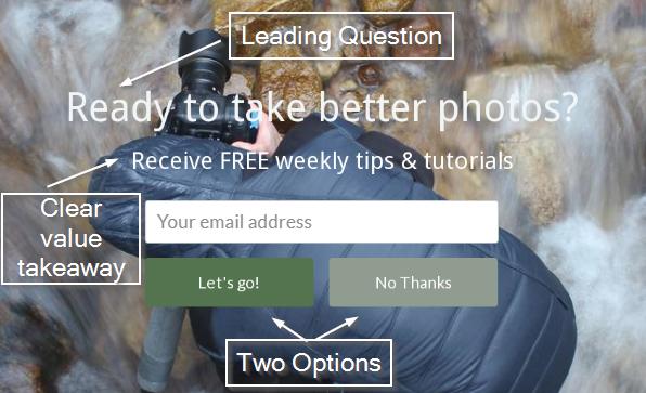
There’s also a good value proposition here. You know exactly what you’re going to get: photography tips and tutorials.
You also know how frequently, so you don’t have to worry about getting overloaded with emails.
And… it’s free.
The icing on the cake is the “no thanks” button, which makes you think twice before turning down the offer. Do you REALLY not want to take better photos?
4. Leverage third parties to build trust.
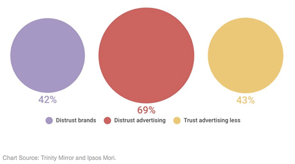
The majority of consumers today — 70 percent — associate ads with other negative online experiences like fake news. Online advertising is regarded as a disruptive experience by 83 percent of the 2,500 people polled by Rakuten Marketing.
Most consumers today simply don’t trust ads. Ironically, consumers trust feedback from unknown, random people more than they trust the word of major brands. Think Amazon Customer Reviews.
People want to see proof before they buy. Preferably from other people who have used your product or service.
Authenticity is key. The more detail the better. Photos of real people with full names, titles and location come across more credible than just a first name and last initial. It may take extra time and effort to collect these but improved conversion rates are well worth it.
There are a variety of ways to build trust with testimonials but Zoho pulls out all the stops with a testimonial bar on their landing page.
The headline tells you that they’ve worked with more than 50,000 businesses. Logos are displayed of some of their bigger clients to give you an idea of the type of clients they work with. Below, they display testimonials from two customers, complete with name, picture, company, and title. This does a lot to sell the service. You’re looking at testimonials from real people. You could go on LinkedIn and verify that these are real people who work for real companies. Their titles tell you that they’re in positions to be able to speak to the efficacy of the product directly. The section ends with a red CTA button, inviting you to “get started for free” if you like what you see.5. Use creative ways to present a contact form.
Sometimes users aren’t quite ready to convert when they first land on your page. They may be unable to decide as they scroll through whatever information you’ve presented them. If they pass up on the initial offer, they need multiple ways to get in touch with you when they decide they’re ready to. At the most basic level, make sure to space out some buttons so users can quickly navigate to a contact form when they decide they’re ready to get in touch. This saves them from having to scroll all the way back up to the original form, or from hunting for a new one. A “slide-in call-to-action” is a contact form that’s set to slide in from the edge of the screen once the user has scrolled to a certain point. There are a few advantages to this. The motion draws the eye, so users typically look at it when it appears. You can also change its timing to an optimal point. You could use scrollmap data to determine where most users stop scrolling on your landing page. Then, place your “slide-in CTA” at that point to give them a nudge to take action before leaving. They also don’t interrupt the user experience, staying out of the main content so it doesn’t slow anyone down.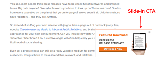 A “sidebar call-to-action” scrolls down the edge of the screen. It’s always there when a user wants it — no need to hunt for a way to contact you. It’s a similar method to the “slide-in CTA”, with a few differences. It’s always there, but as a result, some users may tune it out if they don’t initially use it.
Each of these five tips is proven to help increase website conversion rates. Even small, incremental improvements can yield significant increases in profits over time. We advise testing one conversion rate optimization idea at a time against your existing page and track your performance. Also, ensure you have Google Analytics properly configured. Tools such as website heat maps, unique URLs and unique telephone numbers to track phone calls are extremely helpful.
If you need professional assistance with driving targeted traffic and converting more visitors into sign-ups, leads or sales, consider putting our expert team to work for you. Contact us today for more insight into your campaign.
At AIS Media, our award-winning digital marketing team manages SEO services, PPC management , and social media marketing campaigns that drive site traffic, leads and sales for companies of all sizes and in a multitude of industries. We leverage over 20 years of digital marketing experience with cutting-edge technology to consistently deliver measurable return on investment.
See the type of results we deliver to other businesses.
Get a free digital marketing consultation and proposal.
A “sidebar call-to-action” scrolls down the edge of the screen. It’s always there when a user wants it — no need to hunt for a way to contact you. It’s a similar method to the “slide-in CTA”, with a few differences. It’s always there, but as a result, some users may tune it out if they don’t initially use it.
Each of these five tips is proven to help increase website conversion rates. Even small, incremental improvements can yield significant increases in profits over time. We advise testing one conversion rate optimization idea at a time against your existing page and track your performance. Also, ensure you have Google Analytics properly configured. Tools such as website heat maps, unique URLs and unique telephone numbers to track phone calls are extremely helpful.
If you need professional assistance with driving targeted traffic and converting more visitors into sign-ups, leads or sales, consider putting our expert team to work for you. Contact us today for more insight into your campaign.
At AIS Media, our award-winning digital marketing team manages SEO services, PPC management , and social media marketing campaigns that drive site traffic, leads and sales for companies of all sizes and in a multitude of industries. We leverage over 20 years of digital marketing experience with cutting-edge technology to consistently deliver measurable return on investment.
See the type of results we deliver to other businesses.
Get a free digital marketing consultation and proposal.